
The permanent exhibition ›Art and Ideals: President John F. Kennedy‹ at the Kennedy Center in Washington DC opens to the public today!
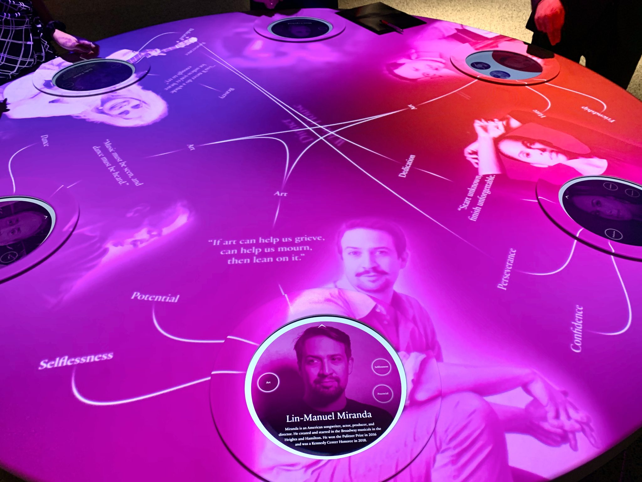
I am thrilled and honoured to have worked with Richard The of TheGreenEyl on an installation that’s part of this exhibition: ›Dinner at the White House‹ – an interactive table, at which visitors are introduced to the historic dinners the Kennedys hosted at the White House. I collaborated on the UI design and developed the backend and frontend software.
The exhibit contains 6 touchscreen plates, through which visitors can simultaneously view the guests who dined with Kennedy in the past and also select contemporary guests they would choose to invite to a dinner at the White House today. Quotes from the invitees appear on the surface of the table suggesting the themes and connections between them.
This permanent exhibition at the living memorial to President John F. Kennedy has been designed by creative director Abbott Miller of Pentagram in collaboration with architects KieranTimberlake, consulting curator Ileen Gallagher and an advisory committee of five leading U.S. historians.
A big shout out to Richard The from TheGreenEyl for commissioning me to collaborate on the UI design of the Interactive table and develop the backend and frontend software. @ardakmukanova, @jiangnan_nichole, @rozi.525 you were an amazing team to work with. Marian Mentrup thank you for the great sound design and collaboration. Krittika Arvind and Andreas Schmelas, thank you for the professional exchange and support.
If you’re in the area, do check out: ›Art and Ideals: President John F. Kennedy‹. It’s open to visitors daily from noon to midnight with free admission and no tickets required.
 After a long time, the name of a great new typeface I used to catch sight of quite often, was wispered to me:
  Yeah, i just got to know another nice typeface:
  Finally i’ve found the typeface of London’s street signs. It’s called